Case Study: Matt Secor Brazilian Jiu-Jitsu
How clarity, accessibility, and conversion-focused design helped a respected local gym better reflect the quality of its in-person experience
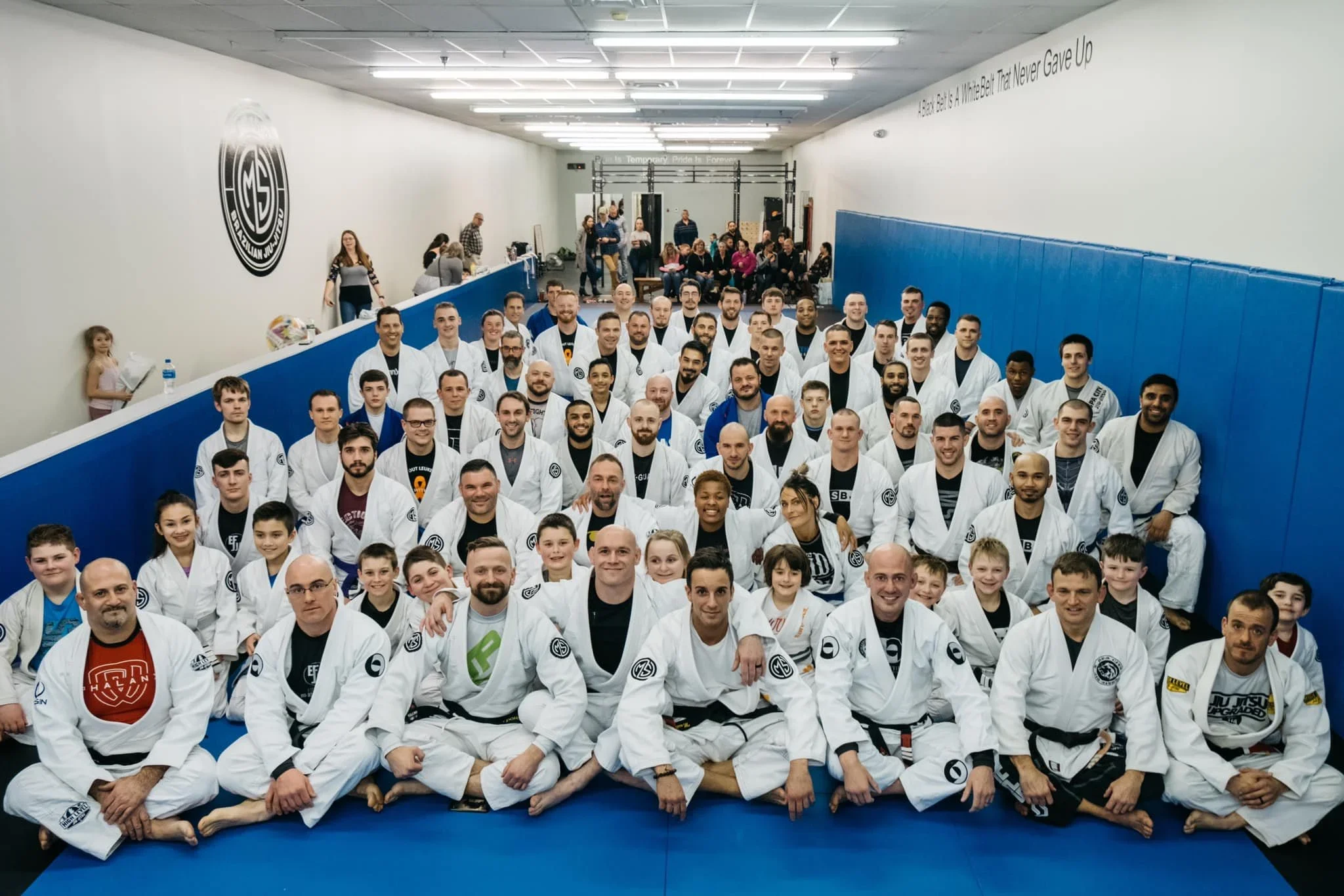
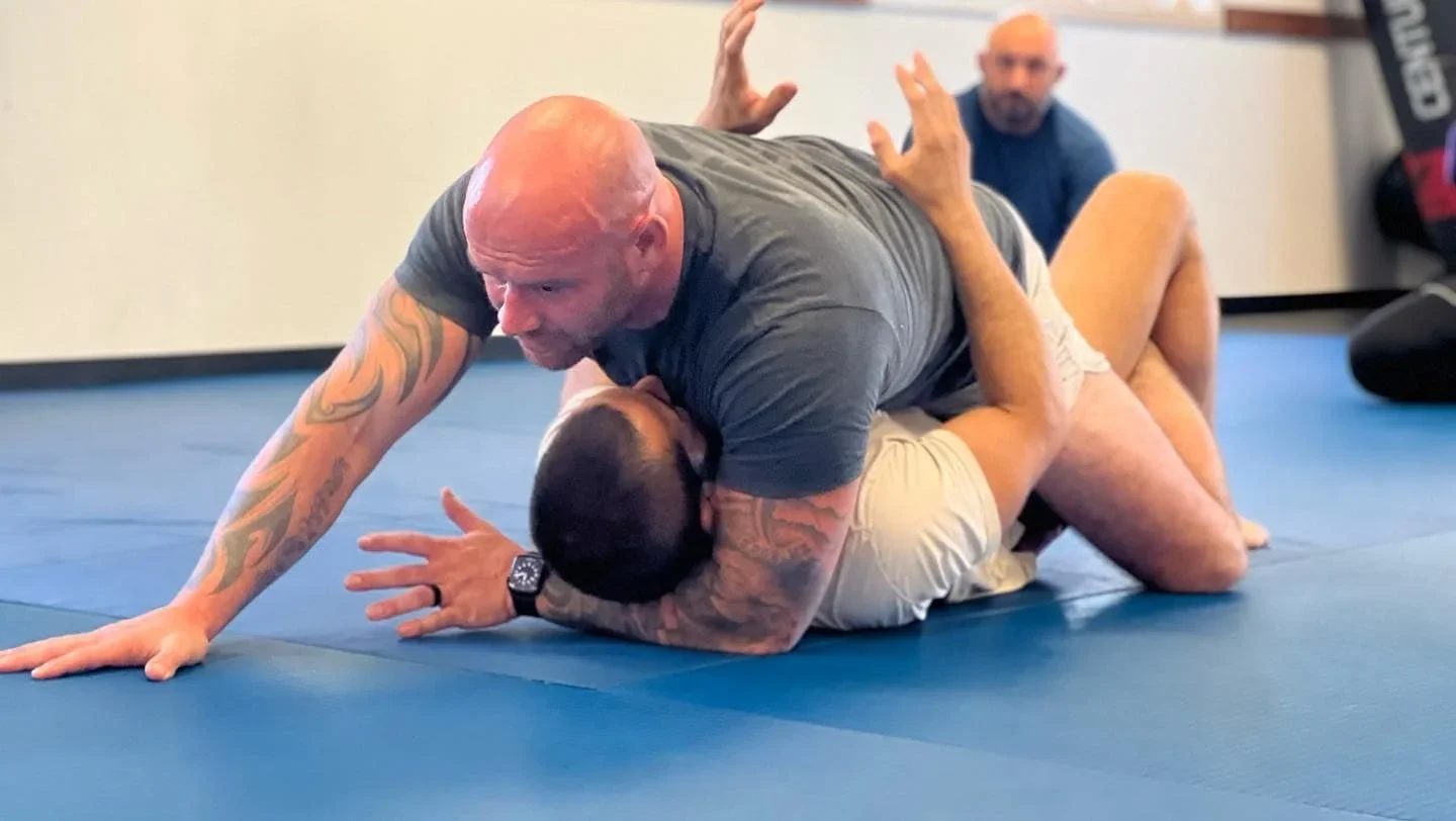
Client: Matt Secor Brazilian Jiu-Jitsu Well-established Brazilian Jiu-Jitsu gym serving South Glens Falls, NY
Chuck’s Role: Website rebuild, UX and conversion strategy, accessibility audit, SEO refresh, mobile optimization
Overview
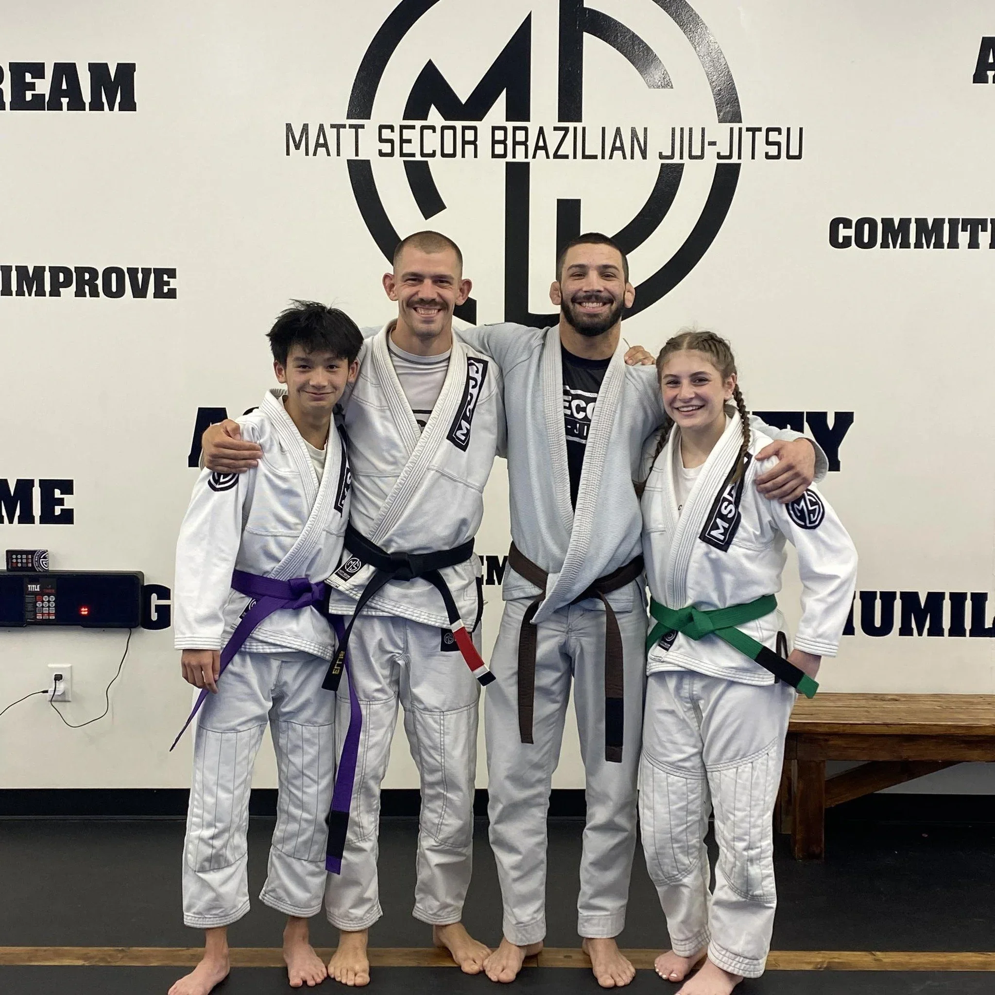
Matt Secor Brazilian Jiu-Jitsu is a highly respected local gym with a strong reputation, experienced instructors, and a welcoming community. In person, the quality of instruction and environment was excellent. Online, however, the website did not reflect that experience.
This case study documents how rebuilding the site with a focus on clarity, accessibility, mobile usability, and self-service enrollment reduced friction for prospective students and better aligned the gym’s digital presence with the professionalism of its physical space.
This project was also personally meaningful. Matt was the first client I worked with after a long pause in my business and the first person to take a chance on me as I restarted my practice following the birth of my son in 2024. That trust helped kickstart my business back into motion, and I remain deeply grateful for it.
Before the rebuild, the website faced several overlapping challenges.
High manual overhead for the owner
Prospective students frequently contacted Matt directly to ask basic questions about:
Class schedules
Age groups
Gi vs no-gi classes
Kids programs
How to try a first class
Many of these questions could have been answered clearly on the site, but the information was difficult to scan and interpret quickly.
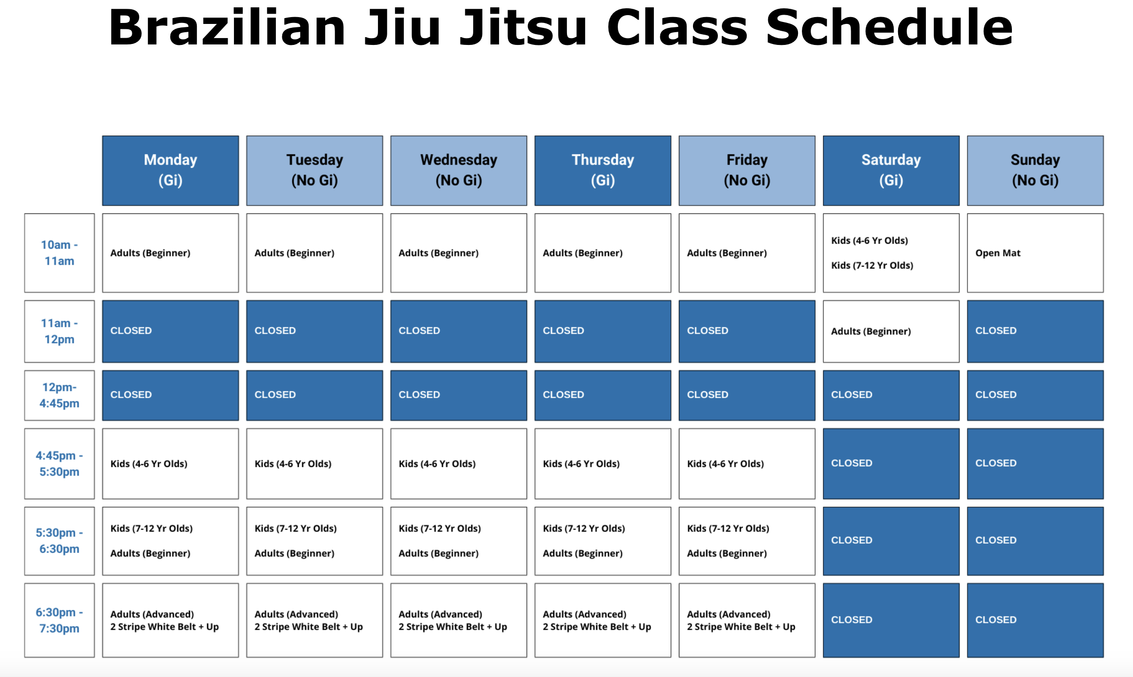
Scheduling confusion
The existing schedule layout made it hard to understand:
Which nights offered which class types
Age ranges for kids classes
Whether a class was gi or no-gi
How new students should start
This created unnecessary friction, especially for people visiting on their phones.
Mobile experience did not match user behavior
Analytics showed that a large portion of visitors were arriving on mobile devices, but the site was not optimized for mobile-first browsing or decision-making.
Digital presence didn’t match the in-gym experience
Matt Secor’s gym is professional, welcoming, and well-run. The website, however, did not fully convey that quality, especially compared to other local gyms competing for attention online.
The strategy
The approach focused on reducing friction, increasing clarity, and supporting self-service.
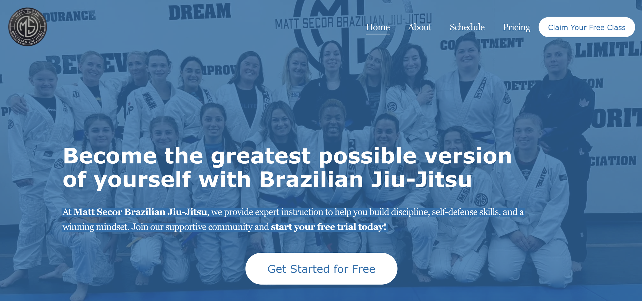
Step 1: Rebuild the site with conversion in mind
The website was rebuilt on Squarespace with an emphasis on:
Clear visual hierarchy
Simple navigation paths
Mobile-first usability
Reduced cognitive load for new visitors
The goal was to help visitors quickly answer one question:
“Is this gym right for me, and how do I get started?”
Step 2: Redesign the class schedule for clarity
A completely new scheduling page was created to make it easy to understand:
Class types by day and time
Kids vs adult classes
Gi vs no-gi distinctions
Age ranges at a glance
This reduced confusion and encouraged visitors to self-serve instead of reaching out manually.
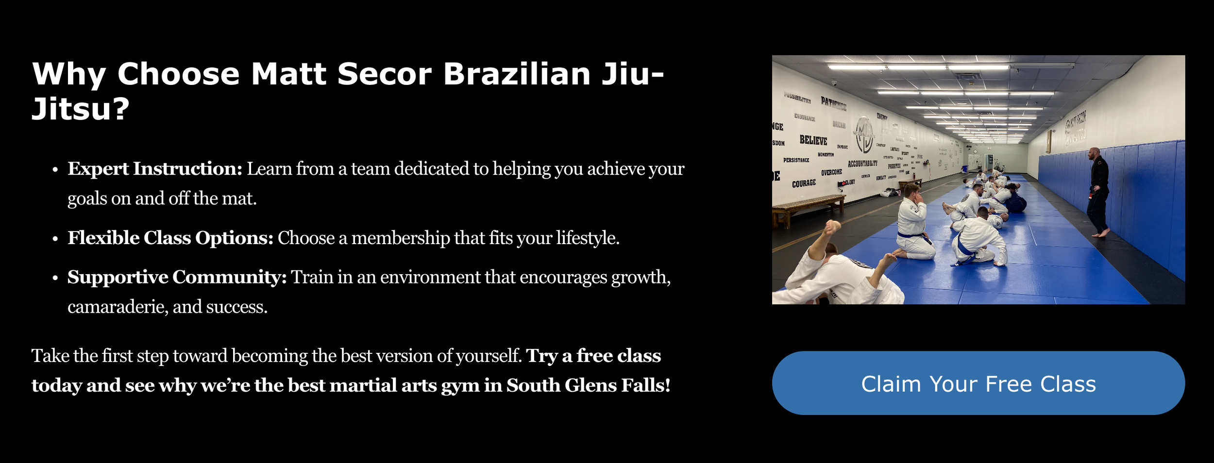
Step 3: Highlight the free first class
The site was restructured to clearly communicate that a first class is free, removing a major psychological barrier for new students and parents exploring options for their kids.
Step 4: Align third-party tools with the brand
The sign-up and scheduling flow relies on third-party tools, but visual and language alignment ensured that users felt like they were still inside the Matt Secor ecosystem rather than being dropped into an external system.
Step 5: SEO, accessibility, and performance improvements
In parallel with the rebuild, I completed:
A full SEO refresh to improve local search clarity
An accessibility audit to improve usability for all visitors
Copy rewrites across the site to reflect real services and values
Google Business Profile improvements to reinforce local visibility
The results
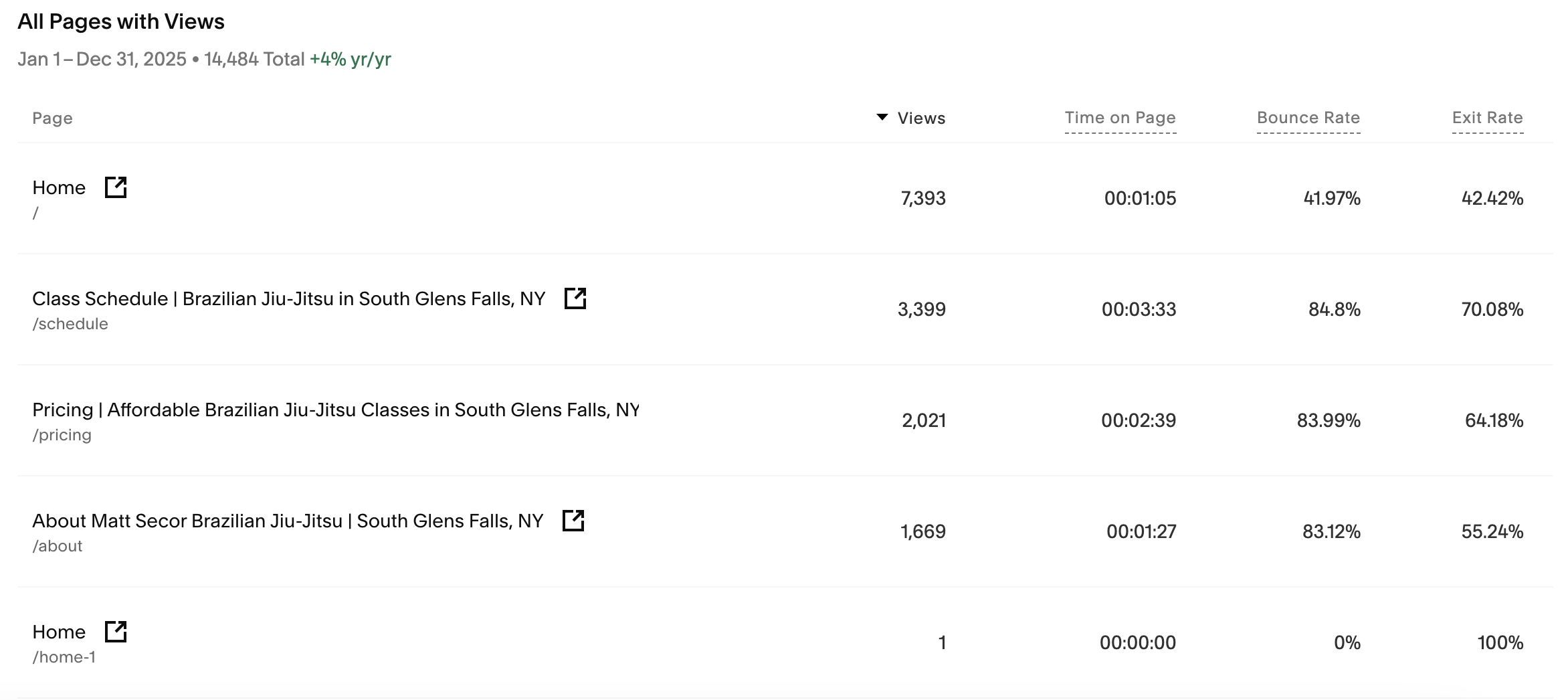
Website engagement and traffic stability
Comparing 2024 (pre-rebuild) to 2025 (post-rebuild):
Annual visits increased modestly year over year
Pageviews increased slightly
Time on page improved
Bounce rate remained stable despite higher clarity and faster decision-making
Importantly, the schedule and pricing pages saw consistent engagement, indicating that visitors were finding and using the information they needed.
Strong search and direct traffic mix
In 2025:
Over 40% of traffic came from search
Direct traffic remained strong, reflecting existing community awareness
Google accounted for the vast majority of search traffic
This indicates that the site was both discoverable and useful once people arrived.
Mobile usage confirmed design decisions
Mobile devices accounted for a significant portion of visits, validating the decision to prioritize mobile clarity and scannability throughout the rebuild.
Reduced manual friction
While not directly measurable in analytics, Matt reported fewer repetitive questions and clearer expectations from new students arriving for their first class.
Why this worked
This project succeeded because it focused on fundamentals instead of gimmicks.
The site was rebuilt around real user questions
Design choices prioritized clarity over flash
Mobile behavior drove layout decisions
SEO and accessibility were treated as baseline requirements, not add-ons
The website was treated as an extension of the in-gym experience
Nothing about the gym changed. The website simply caught up.
Takeaway
A website doesn’t need to be loud to be effective. It needs to be clear.
When a digital presence accurately reflects the quality of an in-person experience, it reduces friction, builds trust faster, and allows business owners to spend less time answering the same questions over and over.
For local service businesses, especially those with strong reputations, clarity is often the highest-leverage improvement available.

About this work
This project reflects the kind of work I do for local businesses that want:
Websites that support self-service and conversion
Clear, accessible scheduling and pricing information
Better alignment between digital presence and real-world experience
SEO and accessibility baked in from the start
If your website feels like it’s creating more work instead of reducing it, I can help you rebuild it in a way that actually supports your business.